Higher education’s advertising winners
By Sharon Aschaiek | May 16, 2018

What makes for an effective advertising campaign by a higher education institution? What are the key qualities that allow a school’s communications and marketing materials to stand out, engage with target audiences and inspire the right types of actions?
Some important clues can be found in the winning projects of the Educational Advertising Awards. Established in 1985 by higher education and health care media company HMR Publications Group, the annual awards shine a spotlight on exceptional advertising initiatives by universities and colleges mainly in the U.S., and a few in Canada. The 2018 winners were announced last month, and there’s a lot to learn from their campaigns’ high standards, creativity and professionalism.
An annual report that shines
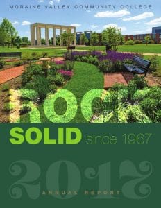
Moraine Valley Community College in Illinois was among 15 institutions that earned a Best in Show distinction. The school’s 2017 annual report stands out for its use of clear, concise content to showcase achievements by the school and its students and faculty. It features a clean, uncluttered design and extensive high-quality photography. The entire look and feel of the publication is warm, upbeat and celebratory, making it an enjoyable read.

A bold new rebrand
The British Columbia Institute of Technology won a silver award for its advertising campaign promoting its new brand identity, Education for a Complex World. The brand aims to show how BCIT equips graduates to anticipate and conquer the complex challenges of our day. Part of the campaign includes a 45-second video highlighting how the school prepares students for our dynamic times. Featuring montages of students engaged in hands-on learning and modern training spaces set against inspirational music, the video projects the school as a place where relevant learning happens.
A website that engages and inspires
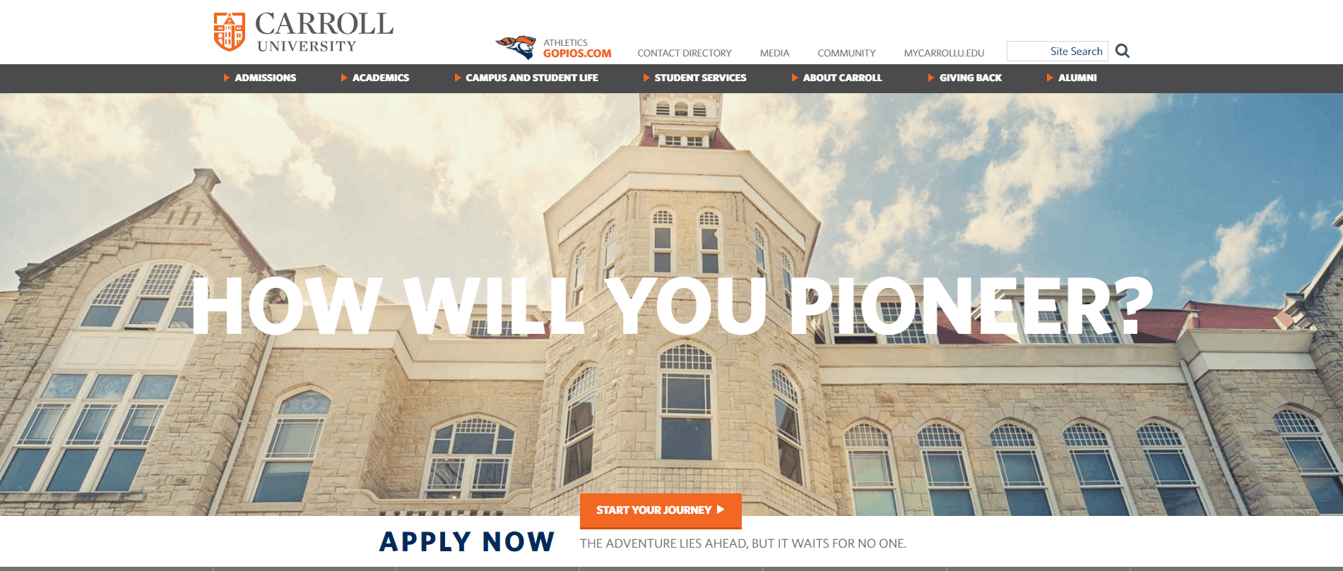
Carroll University in Wisconsin scored a gold award for its website. Borrowing from “Pioneers,” the name of its athletic teams, the school asks in its homepage banner in large. bold capital letters, “How will you pioneer?”, which immediately creates a feeling of possibility and excitement. The site’s orange, blue and white colour theme is sharp. Different sections are represented by large, dynamic images. The site looks and feels fresh and modern and is easy to navigate.
Telling great stories
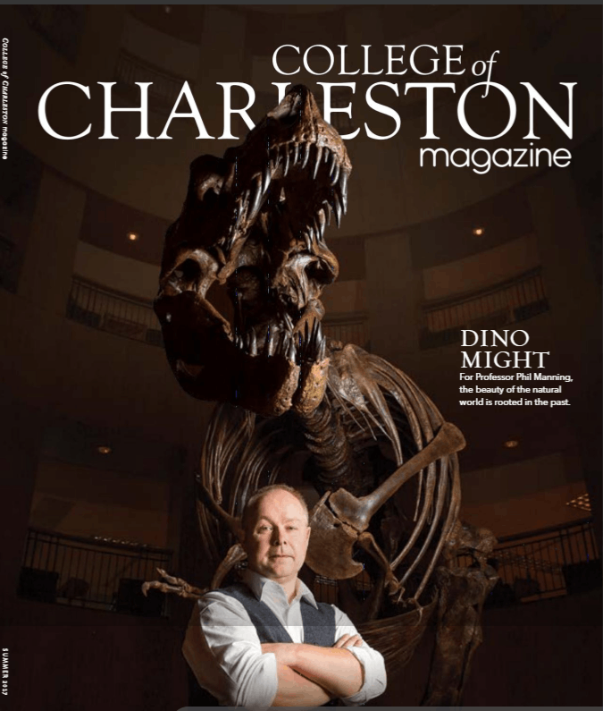
A gold award went to the College of Charleston in South Carolina for its quarterly College of Charleston Magazine. As you can see in the summer 2017 edition, the magazine understands the power of storytelling to brand engagement: it gives considerable space to telling the compelling stories about the activities and achievements of its students, graduates and faculty members. The stories are complemented by a spare, clean design with ample white space, vivid photos and creative graphics.
High-quality communications lie at the heart of all effective higher ed marketing campaigns. Let me help you make your school shine and better connect with potential donors, prospective students, alumni, industry partners and other key stakeholders.
Weekly Blog Posts Sign-up:
Higher Ed Communications News, Views and How-to’s

