
Engage higher ed audiences with infographics
by Sherri Gallowitz, RGD | Oct. 23, 2019
If a picture is worth a thousand words, how many thousands for a good infographic? What IS a good infographic, and why should higher education communication, marketing and advancement professionals care?
More likely than not, your earliest memories are peppered with visuals. One of my earliest memories is from a Florida vacation when I was 4: walking hand-in-hand with my grandmother from our hotel on the Miami Beach strip. I can still see the orange patterned one-piece I wore, my white sandals, the red plastic pail I was carrying. Mostly, I remember what I saw when we reached the beach, which was covered with thousands of bubble gum-pink jellyfish.
Science
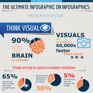
Humans are highly visual creatures, and have been since time immemorial. Our visual acuity was a matter of life and death for thousands of generations—it helped us distinguish those tasty berries from the poisonous ones on the savanna a hundred thousand years ago. Today, scientists have determined that it takes us as little as one tenth of a second to understand a visual scene. In fact, a whopping 50% of our brains are involved in processing visual information. A Wharton School of Business study found that while 50% of members of an audience were persuaded by a purely verbal presentation, that number increased to 67% when the same presentation was accompanied by visuals.
Synthesis
More and more of us are living in a near-constant state of information overload. It’s like trying to drink water from a fire hose. We crave information that is easy to understand. The best infographics do even more than that—they add layers of meaning through the smart use of colour, design, metaphor, even humour and emotion. Higher ed marketing and advancement professionals often need to convey complex information to prospective students, donors, and other stakeholders. An impressive amount of ideas and data on any topic can be organized into a scrolling infographic that is clear, simple to understand and easily viewable and shareable on a smartphone, tablet or desktop computer. The best practice is to use colour to divide the infographic into zones; simple graphics to help with comprehension; and a design that is not weighed down by excessive copy.
Superpower
Understanding how your target audience selects, absorbs and retains information can be your superpower. By all means, build your communications/marketing/development strategy with the utmost care. Craft engaging and incisive messaging to build your brand and make your case. But then, consider an infographic to pack that extra punch, rise above the noise, and drive your audience to take action.
G4Change founder Sherri Gallowitz is a strategic thinker and creative powerhouse. Sherri loves to distill information to its essence, then translate that essence into on-brand creative concepts and design that command attention and move her client’s audiences to action.